Michael Beeks about Beeks Eye & Ear
“We love our business. We love it when our customers go home with a contented smile. With great vision. While hearing the environment. Happy with their new purchases and happy with us. With the new unique ambiance that welcomes you into the shop. You feel seen and heard. Your advisors are enthusiastic, well-trained specialists using the most advanced equipment. We could do a lot already. Now we can do even more. The new Beeks: ‘Even more love for our specialist work!’
Retail Designer Rick Schreuder about Beeks Eye & Ear
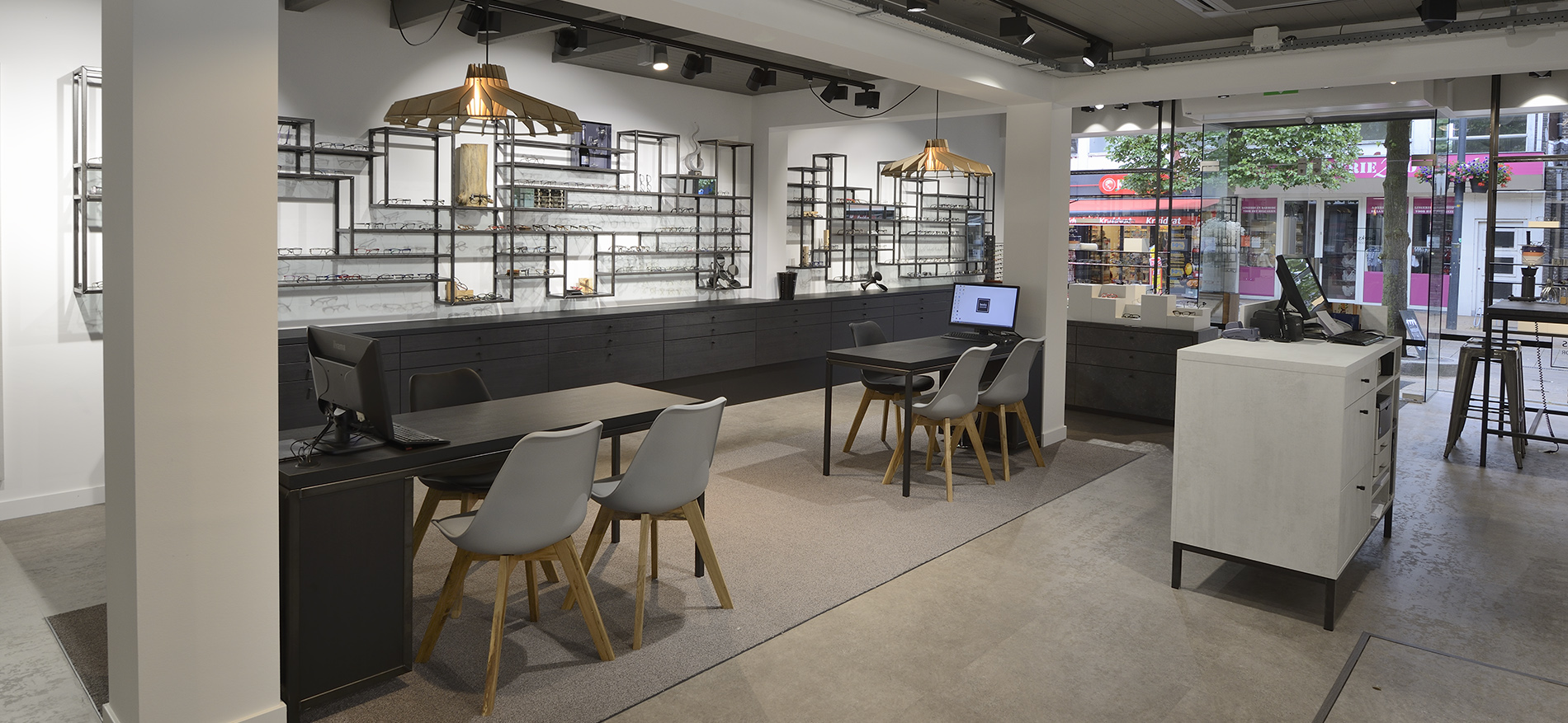
Michael Beeks is a young entrepreneur established in the town center of ’s-Gravenzande. Beeks mainly focuses on the mid to high segment. On the first introduction, they planned for just a light update of the shop. After some sketches, we both concluded that this would work out OK, but without a real wow effect. Michael Beeks loves trendy shop design, just like me. He has a very individual perspective on optician shops, he is a very active entrepreneur pioneering all trends. A light update would not express that adequately. The aim was a cool, young shop that, with all due respect, would not be seen as a ‘standard optician’. An open optician shop interior where people find it easy to move around, with optimal integration of back office/front office. The entire process took 1.5 years. During this time, we quickly decided to enlarge the shop towards the back, giving more space to further expand the refraction spaces and integrate the hearing care professional area into the shop..
Design optician shop and hearing care professional shop
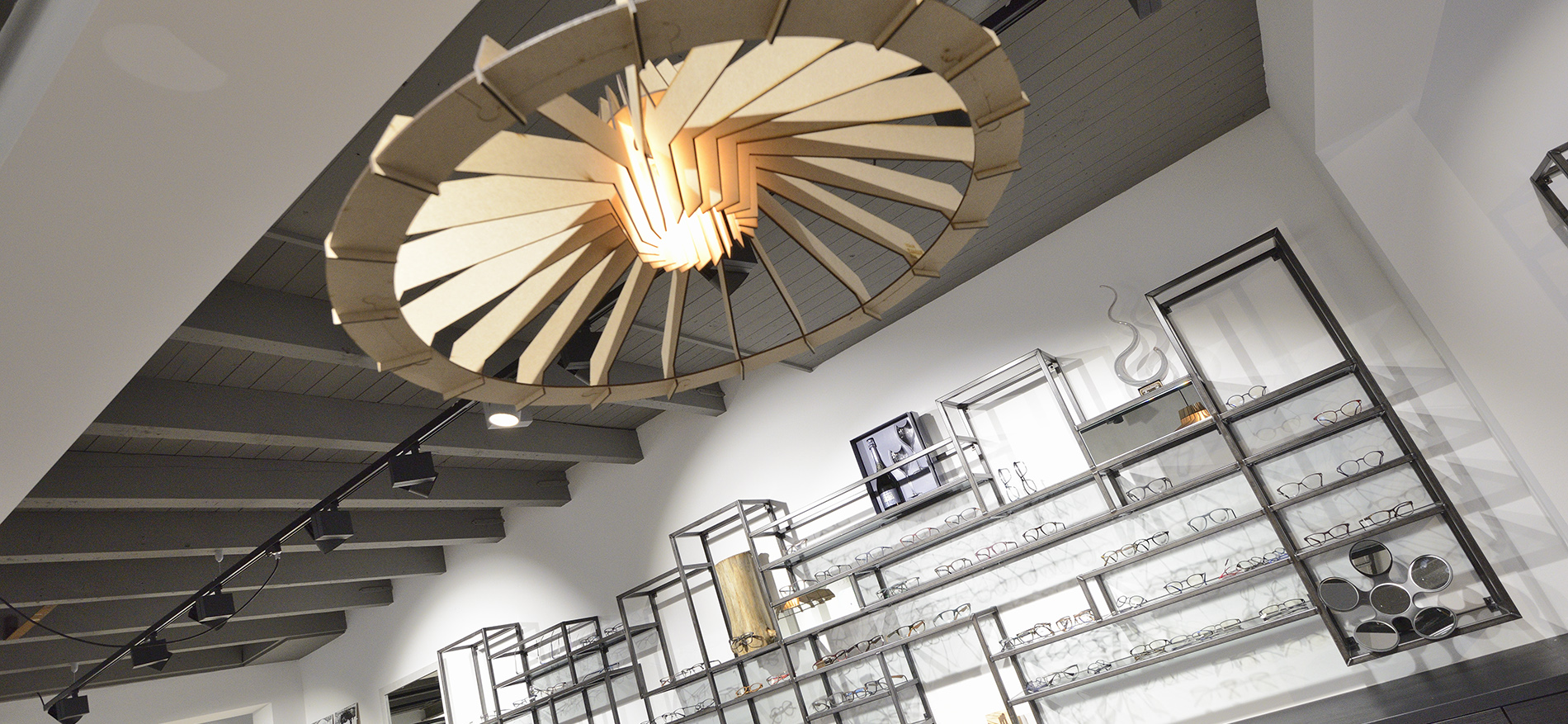
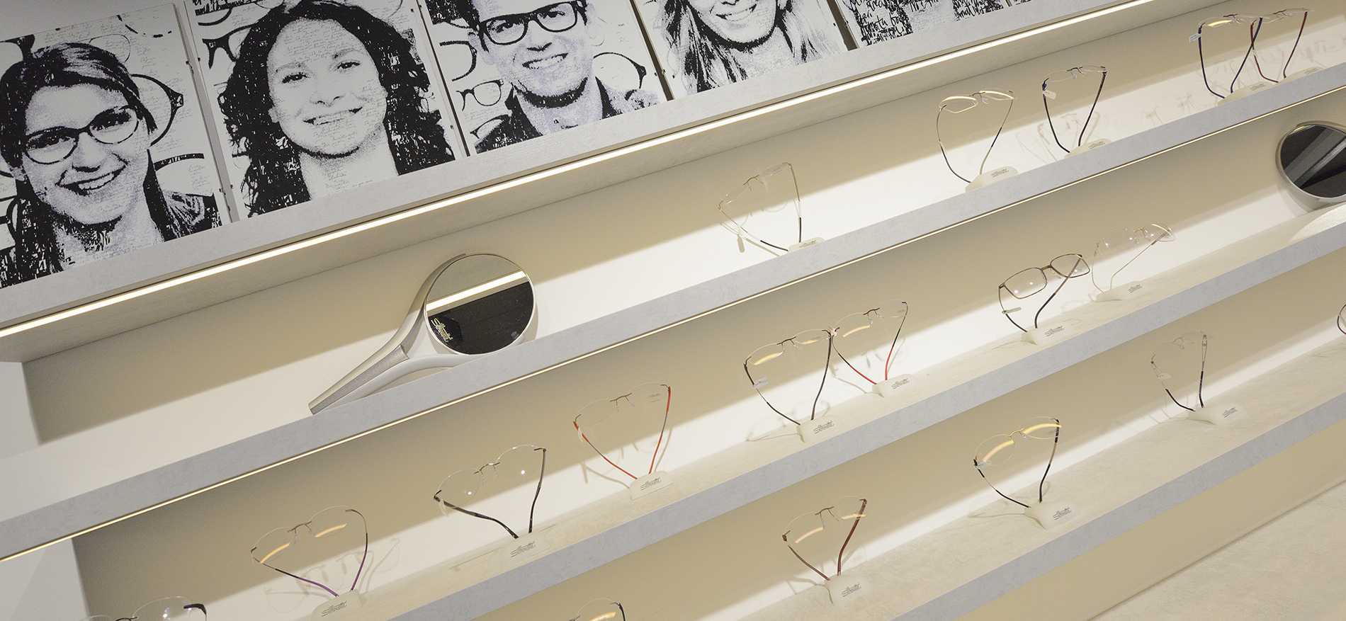
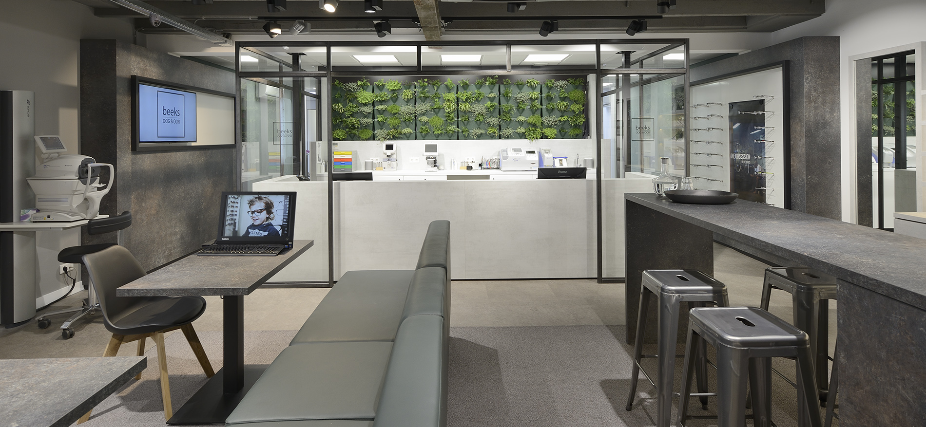
The shop presentation hearing aid shop was significantly expanded. We wanted to give the hearing care professional interior more of a platform. We aimed to give the ‘non-standard look and feel’ by including many pure materials and unconventional frames presentations (in steel frames, interspersed with cool decorations), spray-painted ceilings, raw look and feel of the furniture, integration bar / waiting area / coffee corner, studio is a greenhouse type (many greenhouse businesses in this area!) with a central position in the shop.
Store interior opticians with Living Green
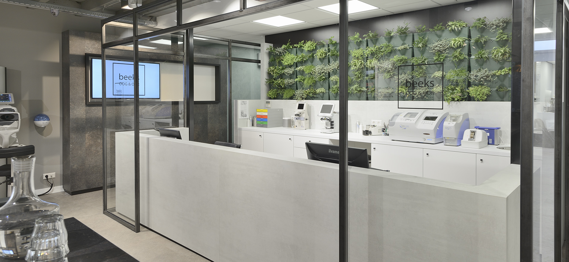
A key component of the shop design opticians shop is the introduction of living green. The back wall of the shop is now a living green wall, specifically customised. Everything combined, it has become a shop where the various functions orientation / helping customers / pre-scan eyes / waiting / repairs of spectacles are all clearly performed in a single space, creating dynamics in the shop. Michael’s excellent knowledge combined with WSB’s retail experience created a highly individual, young, metropolitan shop with a trendy shop design without alienating the older customers, and that ties into the local area and residents. Michael’s young team, the customers and the shop have become a super cool whole, all pieces of the puzzle perfectly in place.
Renovation plans?
WSB’s retail architects are progressive designers of store concepts in fashion, shoe fashion, jewellery hearing care professionals and opticians. WSB is active in the Netherlands, Germany, Belgium, Luxembourg and France. WSB works for both fashion brands and individual shops.
Do you also have renovation plans? Do you want smart renovation in your shop? Are you looking for the ‘non-standard feeling’? Are you also curious to see a trendy shop design for your optician shop? Do you want to know what we have in store for your shop in eye care and eye fashion? Then call WSB at +31 332771717 or email us at info@wsbdesign.com
Realization
- Location 's Gravenzande
- Time 2 weken
- Size 214 m2
- Delivery 2015
- Design WSB Retail design
- Development WSB Shopfitting
- Branche Audiology Hearing Care
More information?



 Mail
Mail  Call
Call