Realization
- Location Amersfoort (NL)
- Time 6 weeks
- Size 224 m²
- Delivery Turn key
- Design WSBDESIGN.COM
- Development WSB Shopfitting
- Branche Jeweler
More information?
Grand and impressive renovation in Amersfoort
Family business Van Hell Juweliers (based in Amersfoort and Apeldoorn, NL) has undergone a serious expansion and makeover in Amersfoort (NL). To the team at WSBDESIGN.COM the task of creating a substantial extension to the back.
This involved renovating the front part of the shop and retaining the existing façade. In 2007, the shop (90 m²) was completely redesigned, both on the frontage and interior. In 2010, the shop was extended to the back with a wedding ring corner. Unfortunately, the available rear space was so low that a serious expansion kept running into structural and height problems.
In close consultation with the landlord, a rigorous approach was chosen: starting from the rear façade of the main building, the available low-rise will be completely demolished and replaced by a new shell in which “height” was a key word.
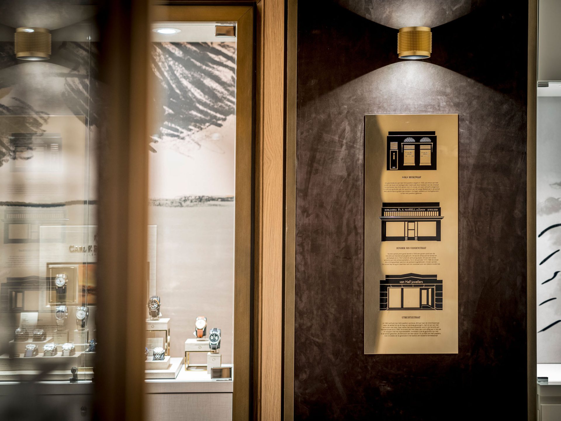
An established name in Amersfoort since the 1930s, Van Hell has since built a reputation in the Haute Couture Jewellers segment. WSB was commissioned to develop an appropriate new formula here that did justice to the clientele and the collection. Contemporary, warm and with a classic touch were the key words guiding the design process. The budget was taken into account and thus the front part of the (existing) shop was left partly intact. But to merge with the new building section.
Precious materials and refined detailing
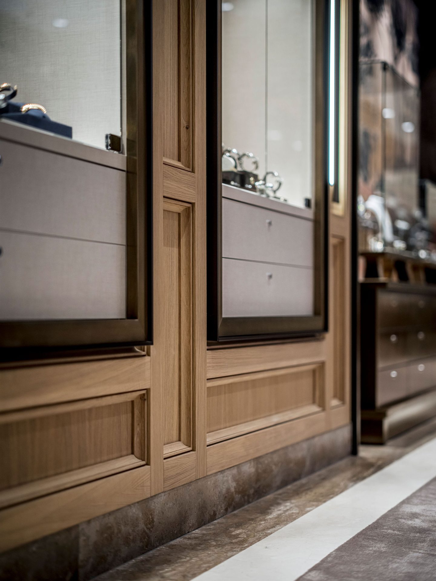
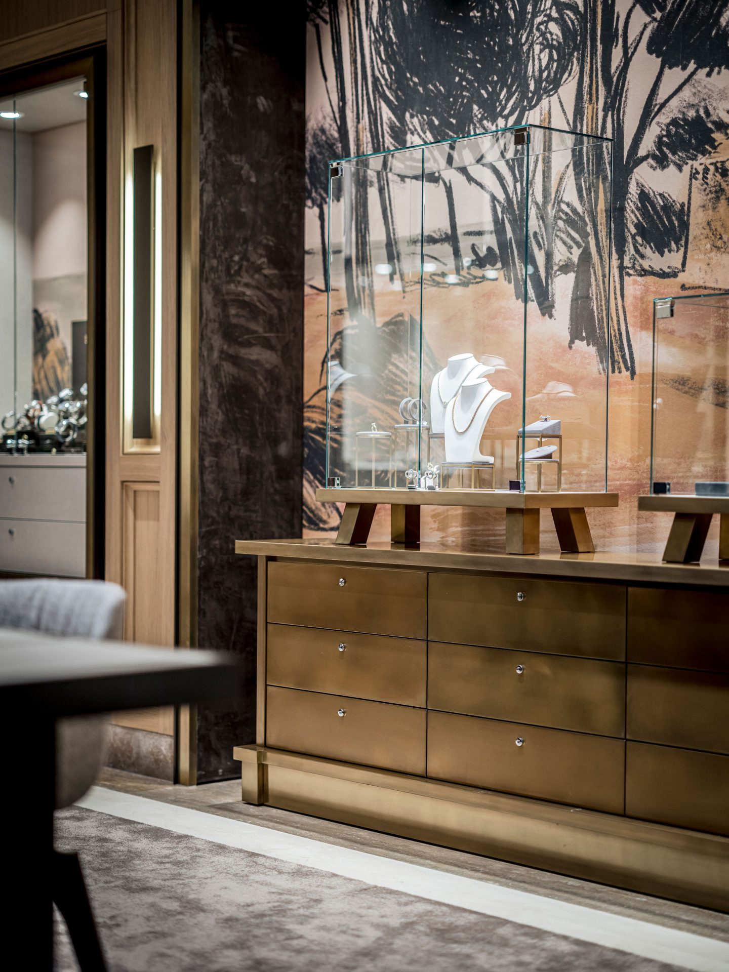
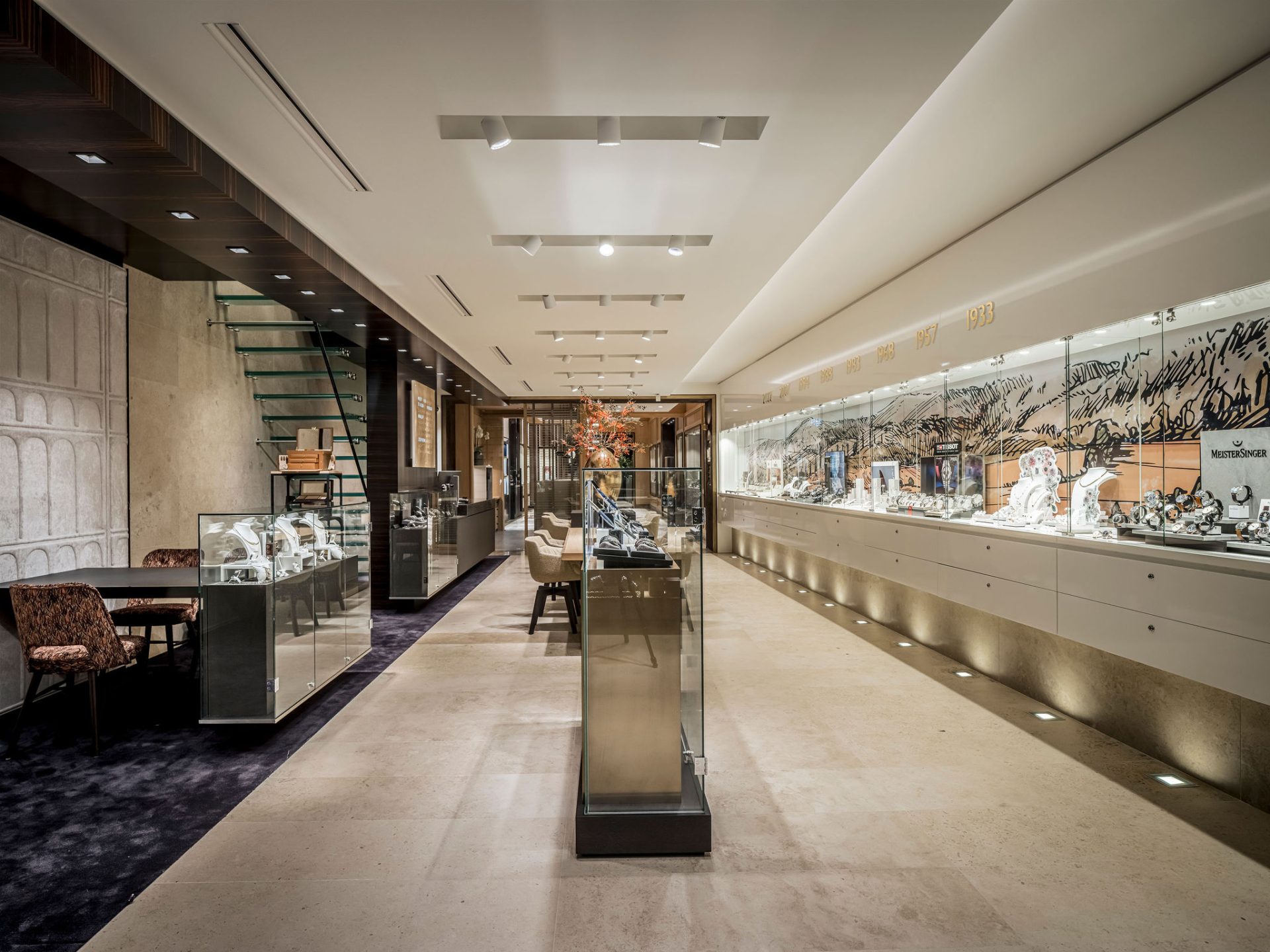
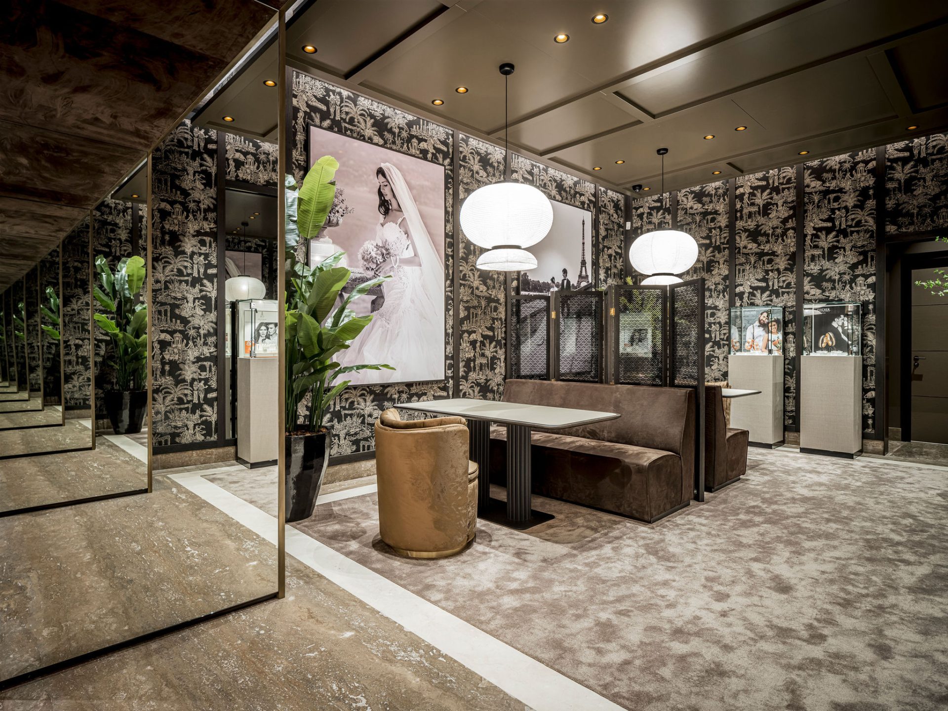
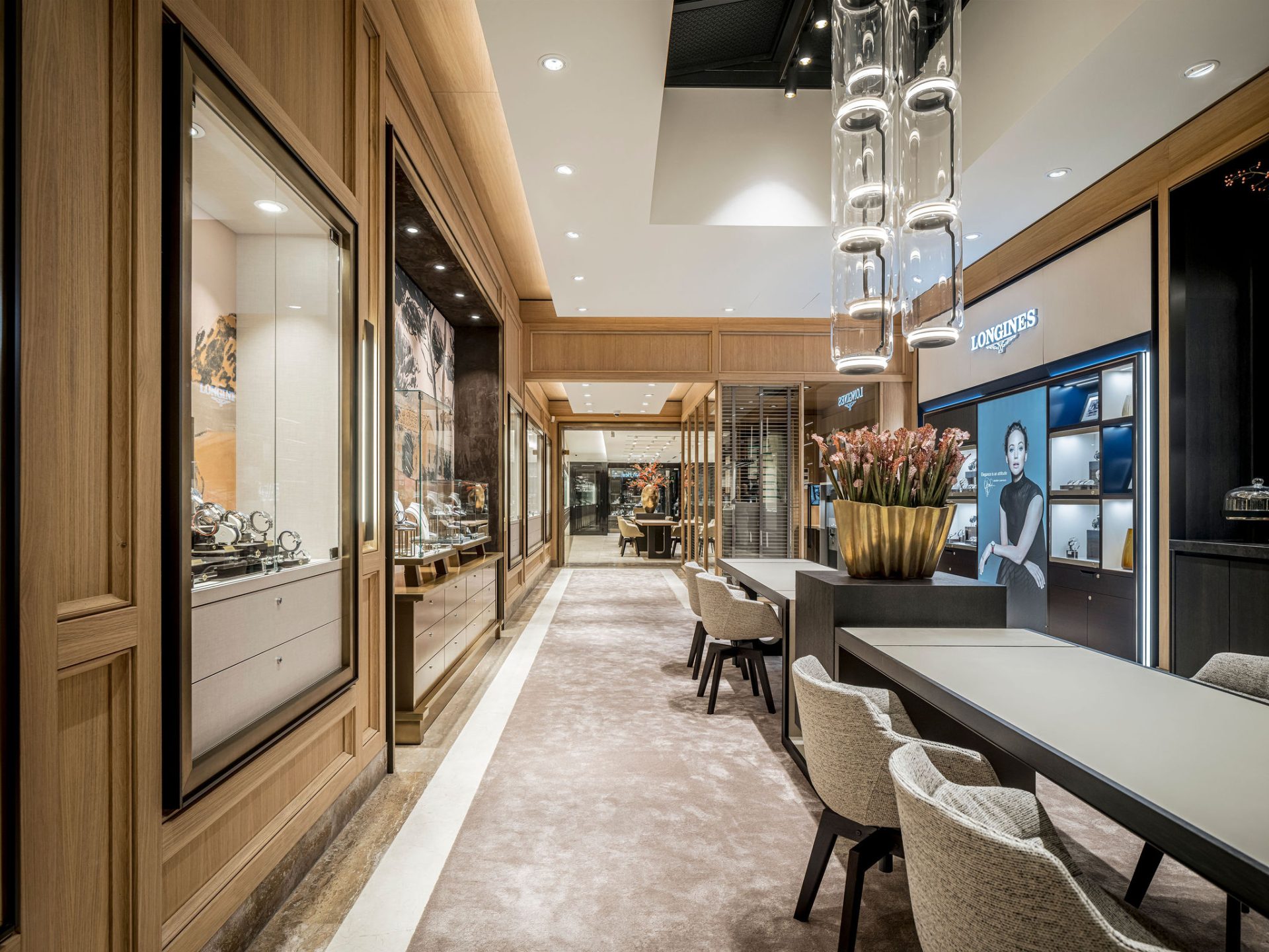
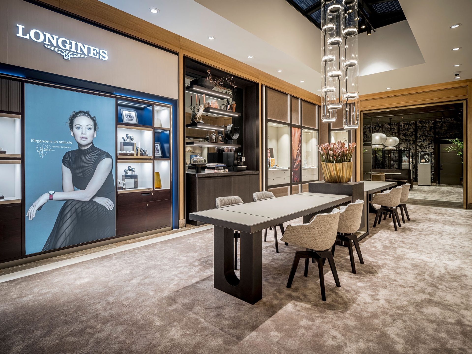
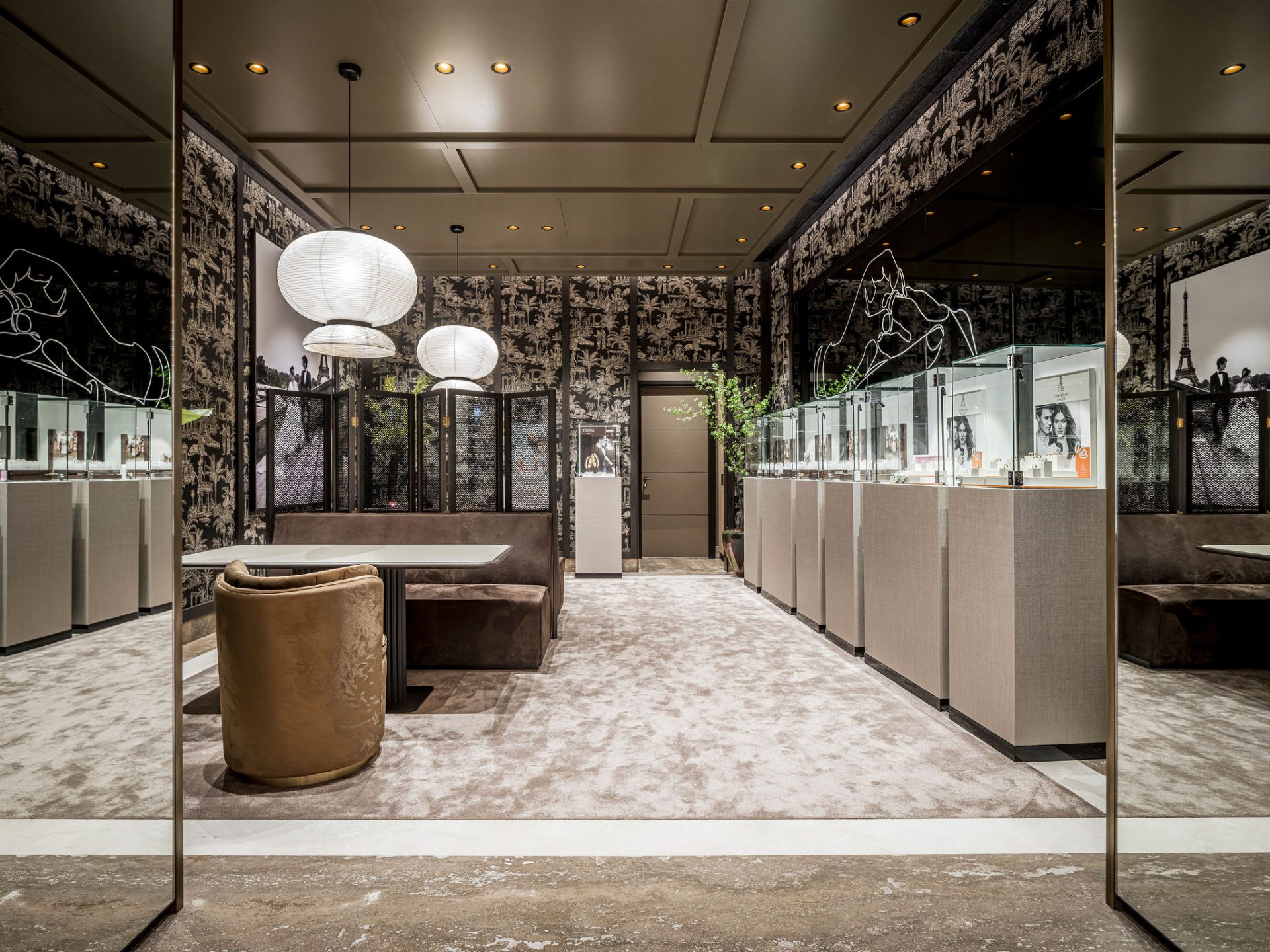
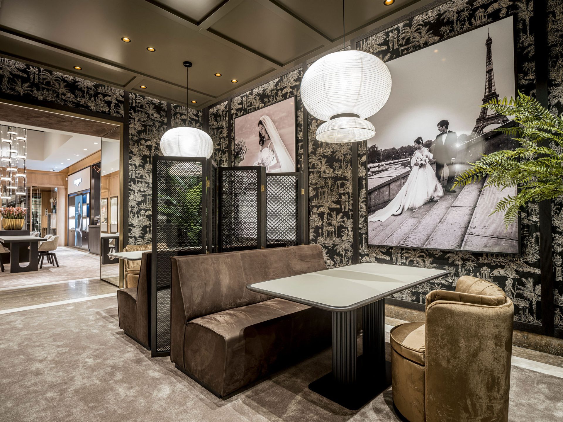
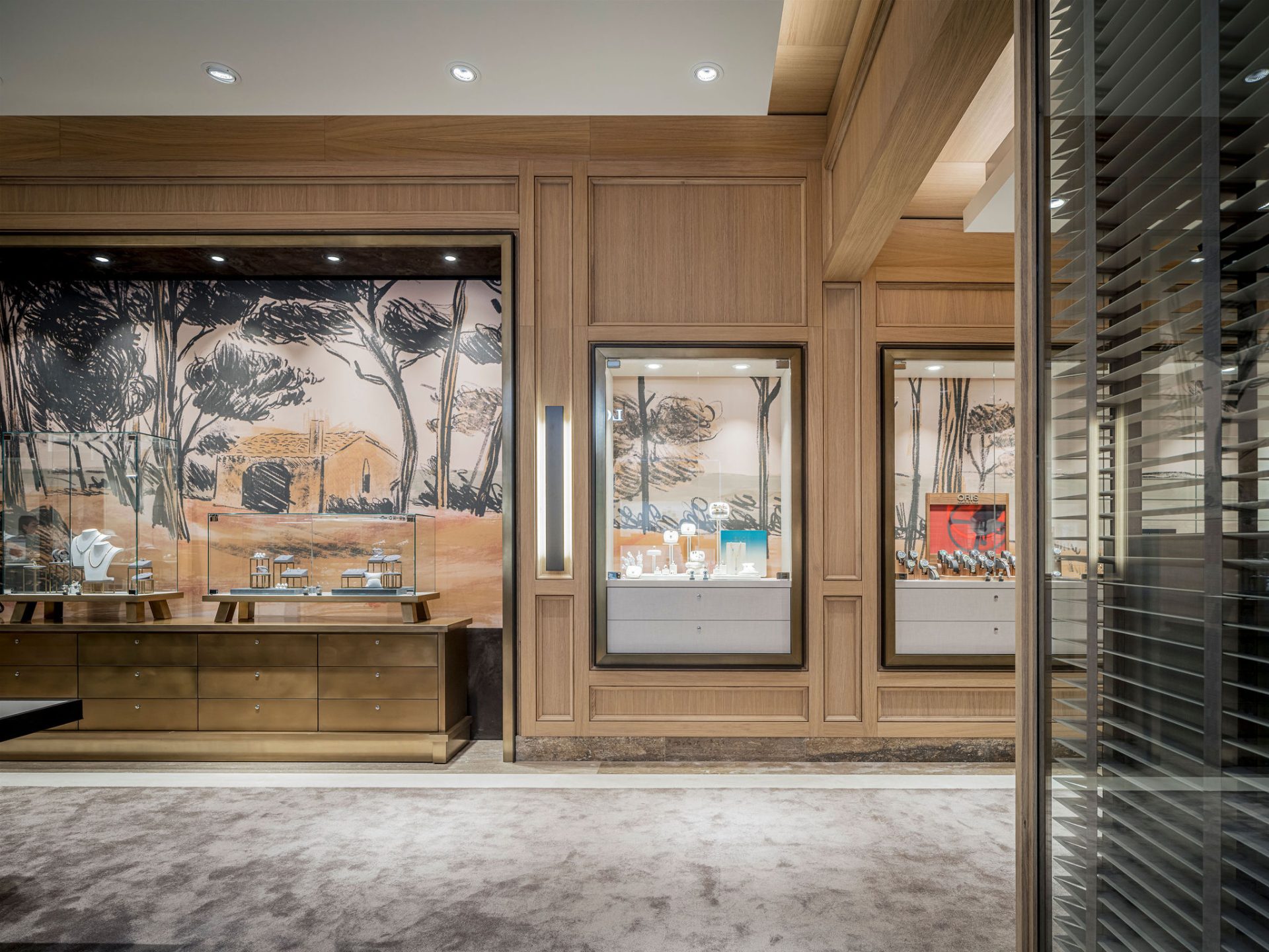
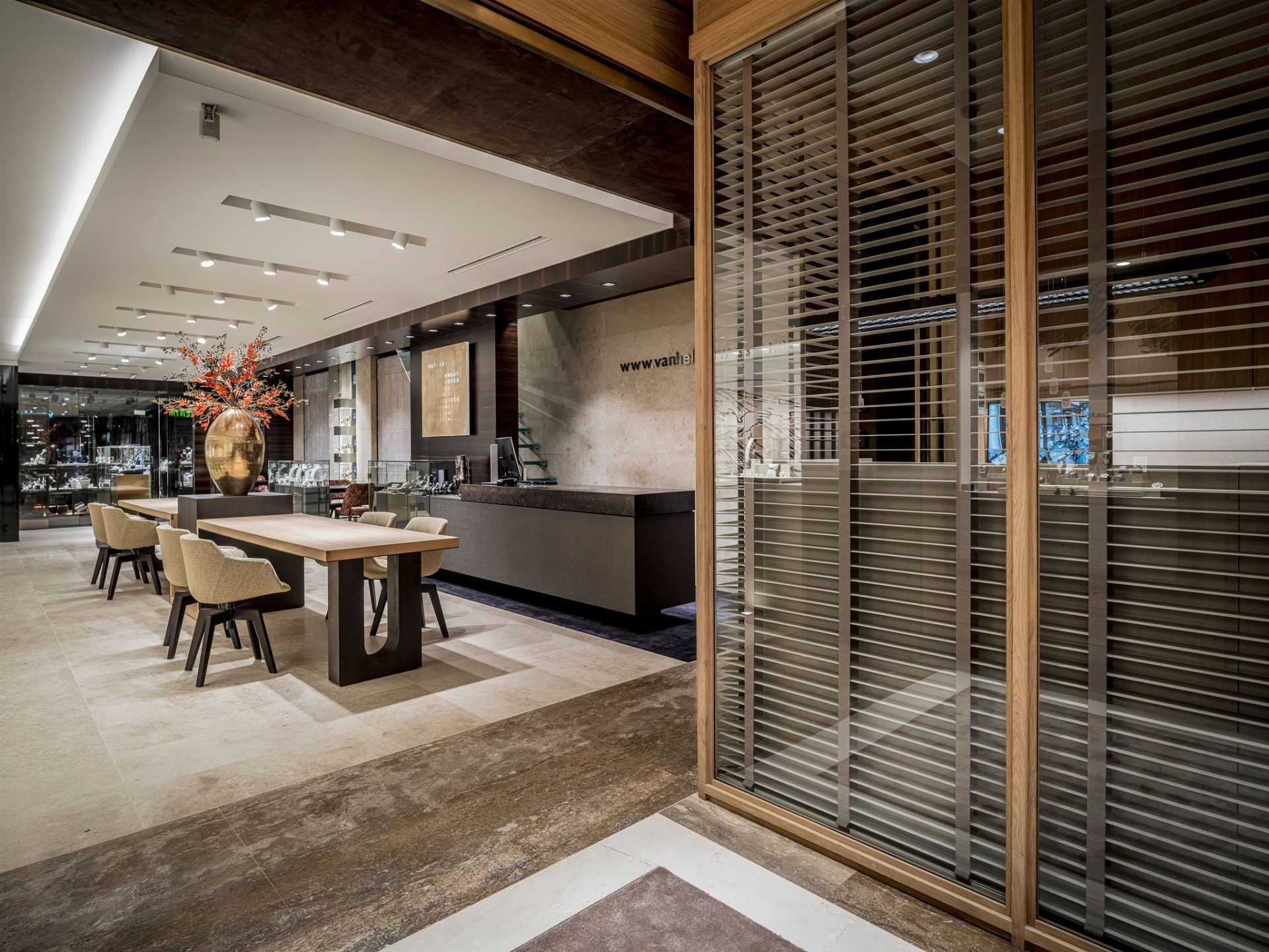
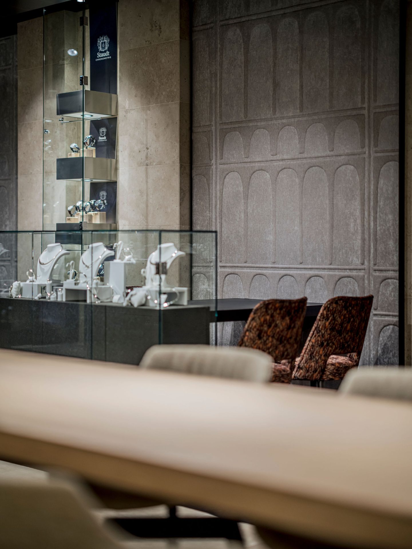
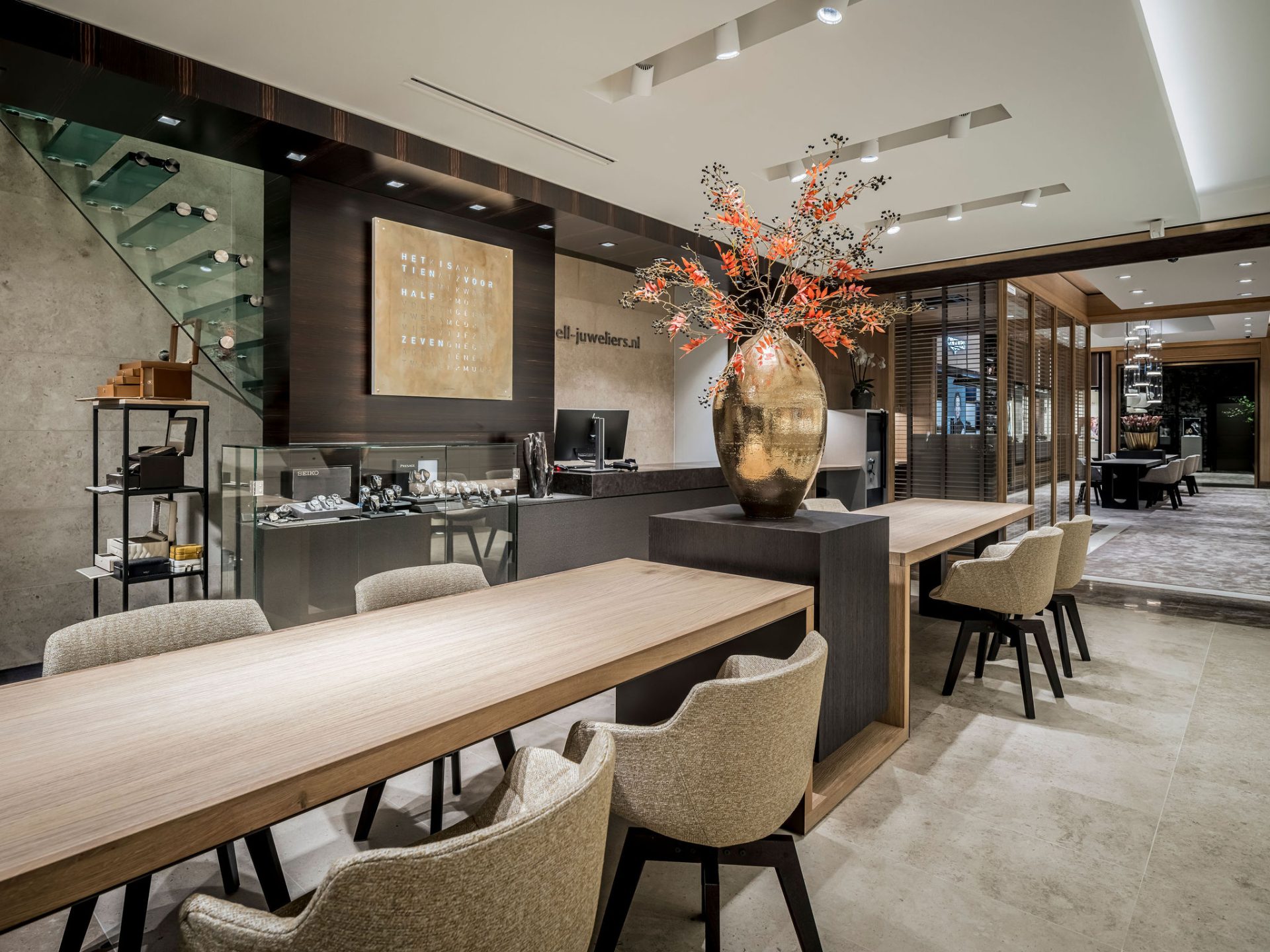
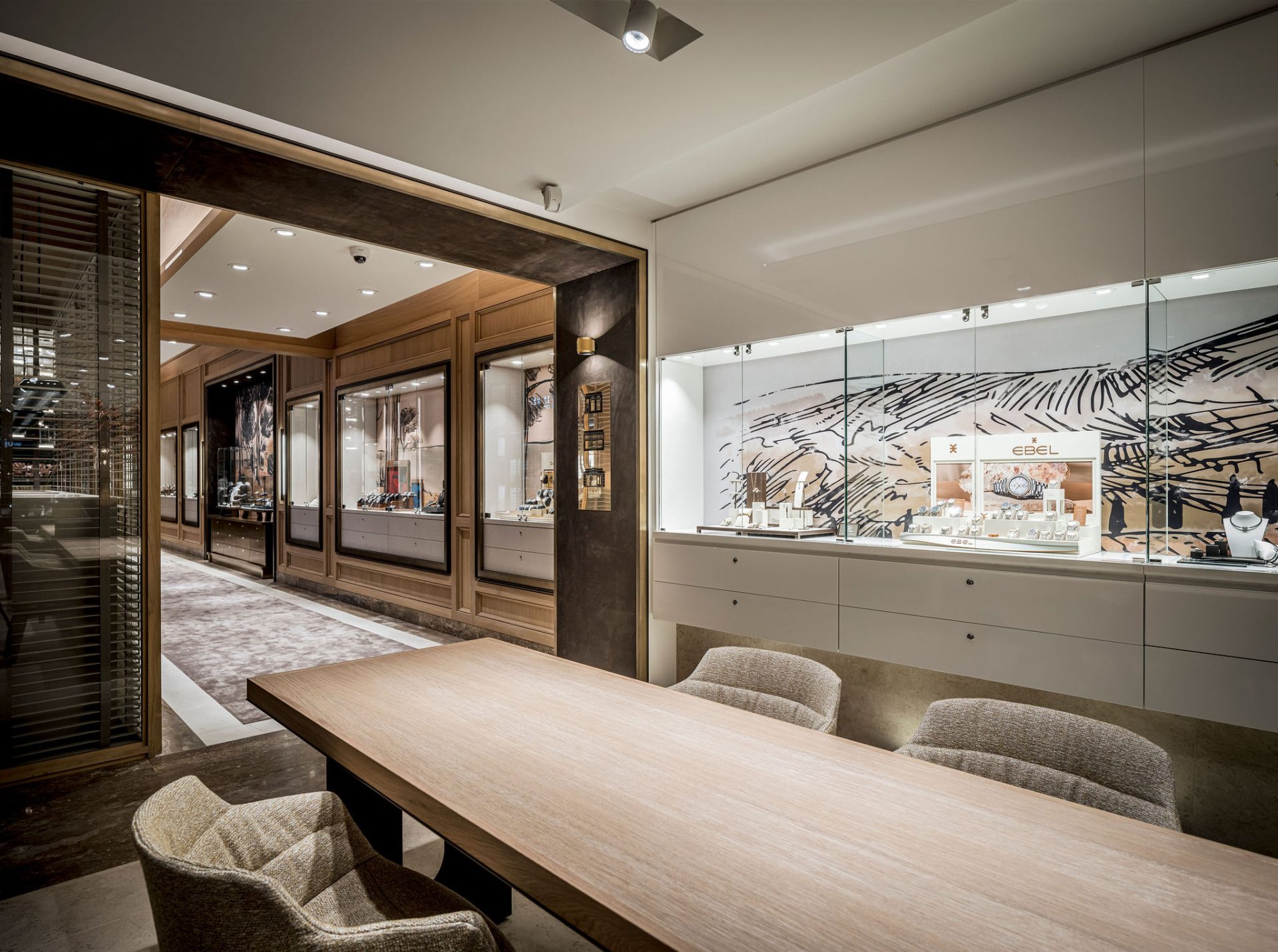
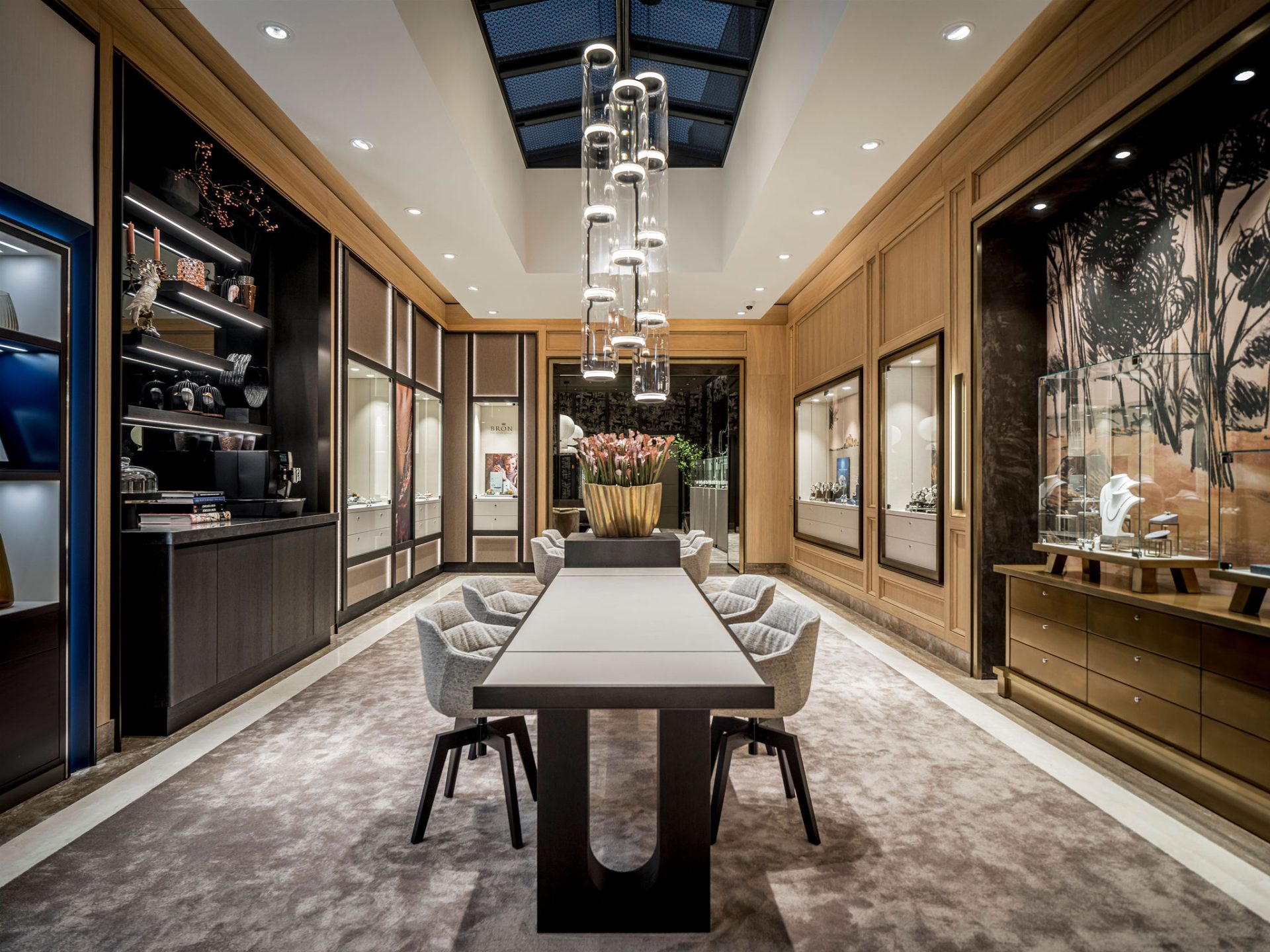
In keeping with the existing shop interior, where the natural stone floor and Coromandel wood play a dominant role, the choice was made to make the new part of the shop different but complementary with a more classic touch. The materials are natural stone (as in the front part of the shop) in two colours combined with brushed oak. The gold-coloured elements combined with Visual Art wall coverings add surprise and warmth. In the wedding rings corner, the existing display cases have been renovated and reused. These stand out perfectly in a totally different setting. Warmth with a beautiful wallpaper by Arte, which also has an acoustic effect, provides a pleasant noise reduction.
Change of environment increases length of stay
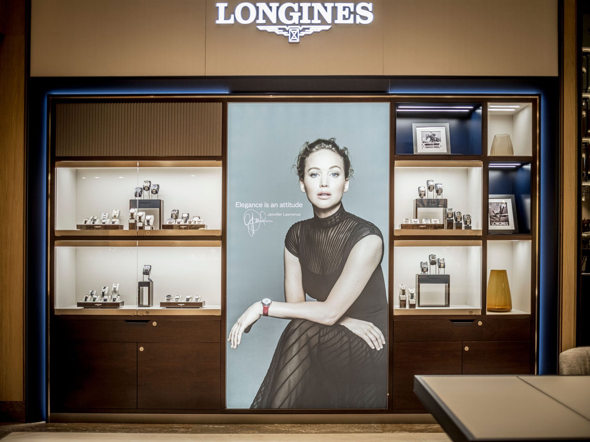
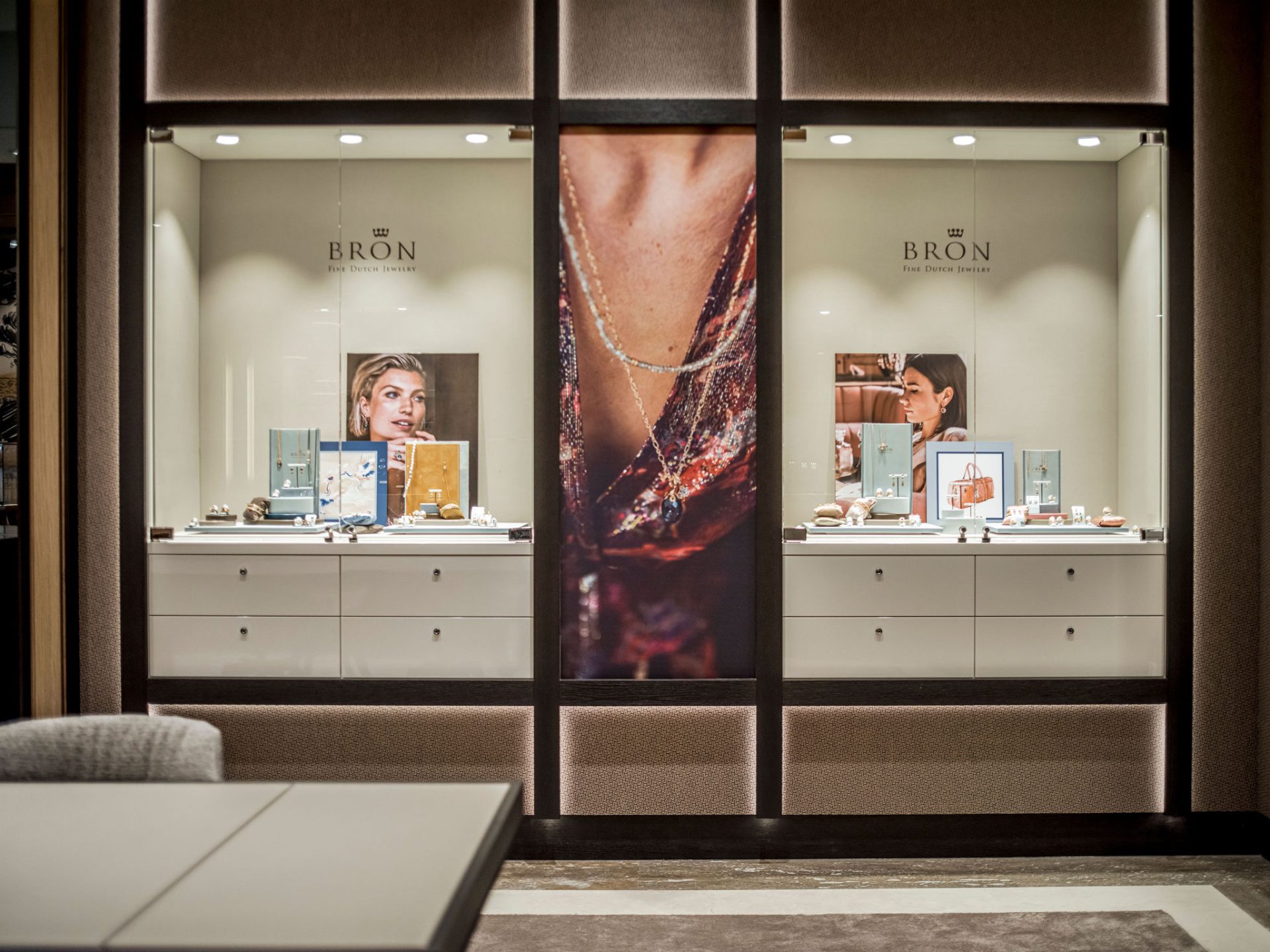
The shop is thus divided into three experience compartments. The first part is the old restyled shop. The second part is a combination of its own showcases and two brands: Longines and Bron. The third part is the wedding rings corner. The second part in particular, with its daylight and coffee/wine corner, is the heart of the shop. It also houses the atelier, which has a nice transparent connection to the shop and thus remains one. Optical contact with the customer!
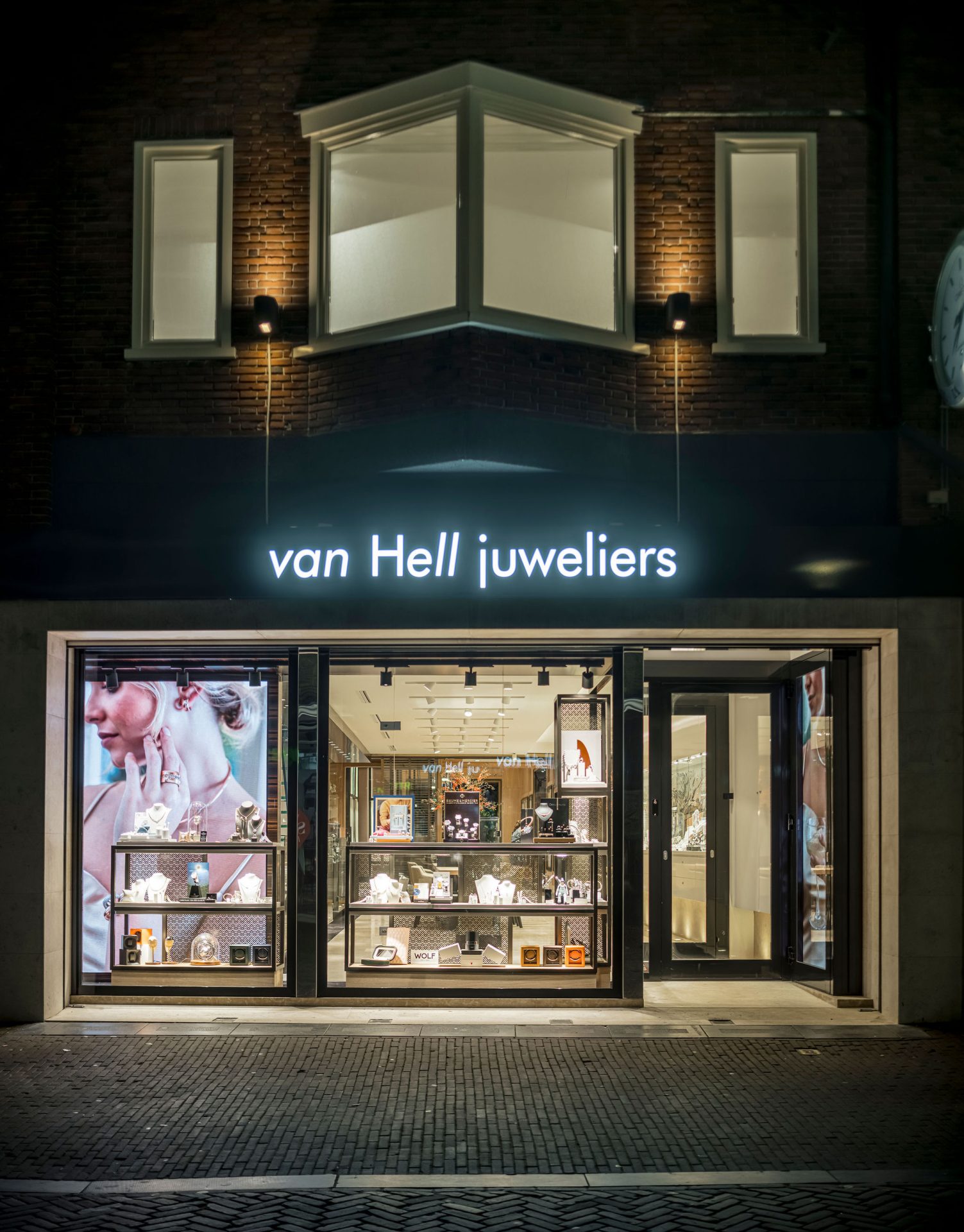
The façade is existing but with a black high-gloss film that creates a greater contrast between the highly polished stainless steel. The new illuminated advertising pops out and, combined with two fantastic LED wall-filling screens, the attention value of the shop window has been increased by 1,000 per cent. The customer reactions are praising as is the successful start of the sales team!
Design & realisation jeweller WSBDESIGN.COM.



 Mail
Mail  Call
Call 