Design and turn key Realisation>> WSB Shopfitting Group from Holland
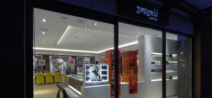
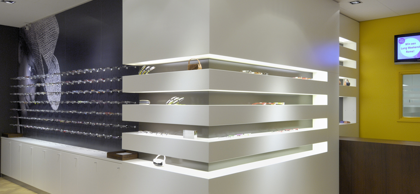
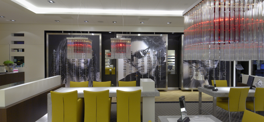
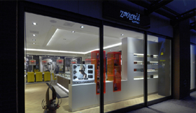
Briefing>> Understated, sober, architecture with a leaning towards classic materials in a sleek design. The store communicates in images and form on a level at the top of range and target group.
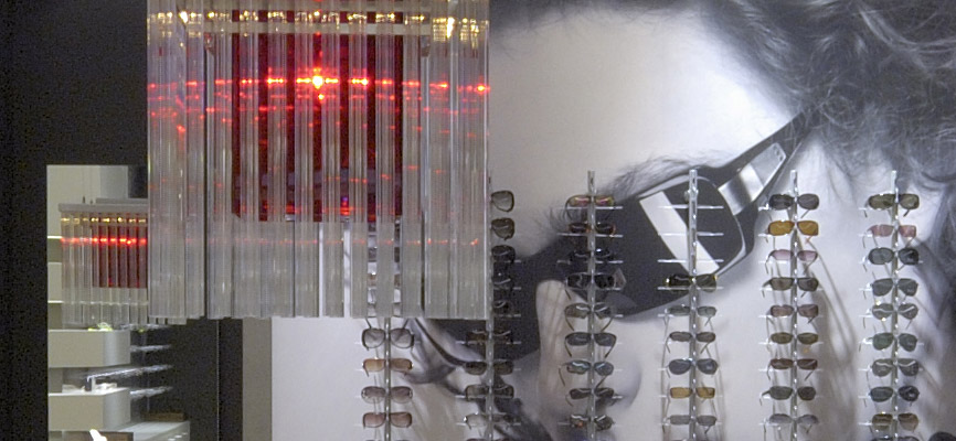
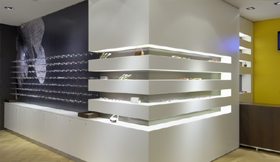
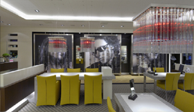
Comments>> Good architecture contributes to the profitability of the store, people love it and those who apply it, are rewarded. Beautiful lines and beautiful materials are combined with subdued in store communication. A sophisticated lighting plan with pronounced fixtures above the strategic sales points increase the attention and help in the sales process.
Realization
- Location Heiloo (NL)
- Time 4 weken
- Size 170 m2
- Delivery 2007 / 2015
- Design WSB Retaildesign
- Development WSB
- Branche Optician
More information?



 Mail
Mail  Call
Call